


Fan Mail Corner #007
What is a "SPOT" color?

Hello friends,
Hope you are all well. Things have been busy over here, with all good stuff; little ones starting school, books getting sketched, author visits getting booked, etc.
This week I want to answer a question from author/illustrator extraordinaire Rilla Alexander. Rilla’s books are a favorite in our house, as they ooze charm and sophistication. I’ve long felt a sort of illustrator-kinship with Rilla because we both so often work with limited color palettes and specifically SPOT COLORS.
Rilla writes:
”Hi Greg,
I was just thinking about you, because I got an email from someone asking me how to separate pantone colours from Photoshop. I’d love to hear what you do when you get a chance!”
Thanks, Rilla! I will do my best to explain how I use SPOT COLORS, and I’d be curious to know if any of my readers have a similar way of working.
Many of my projects are printed “SPOT” and I guess I should first define what that means.
Nearly all picture books, and many printed things like menus, food packages, etc, are printed using a process known as 4-COLOR-PROCESS printing.
This means that the colors you see on a printed page are actually a trick of the eye. They use small dots to give the illusion of many colors, but actually only print using the (4) colors CYAN, MAGENTA, YELLOW, and BLACK. This process is often referred to as CMYK. Any one who has ever bought ink for a home printer will recognize these colors. Let’s take a look at a real-book example:
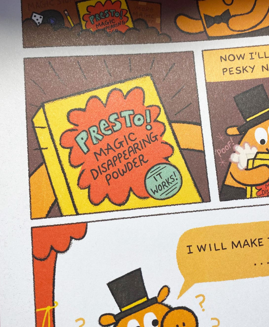
Check this image from my book Baloney and Friends (the first of the series):
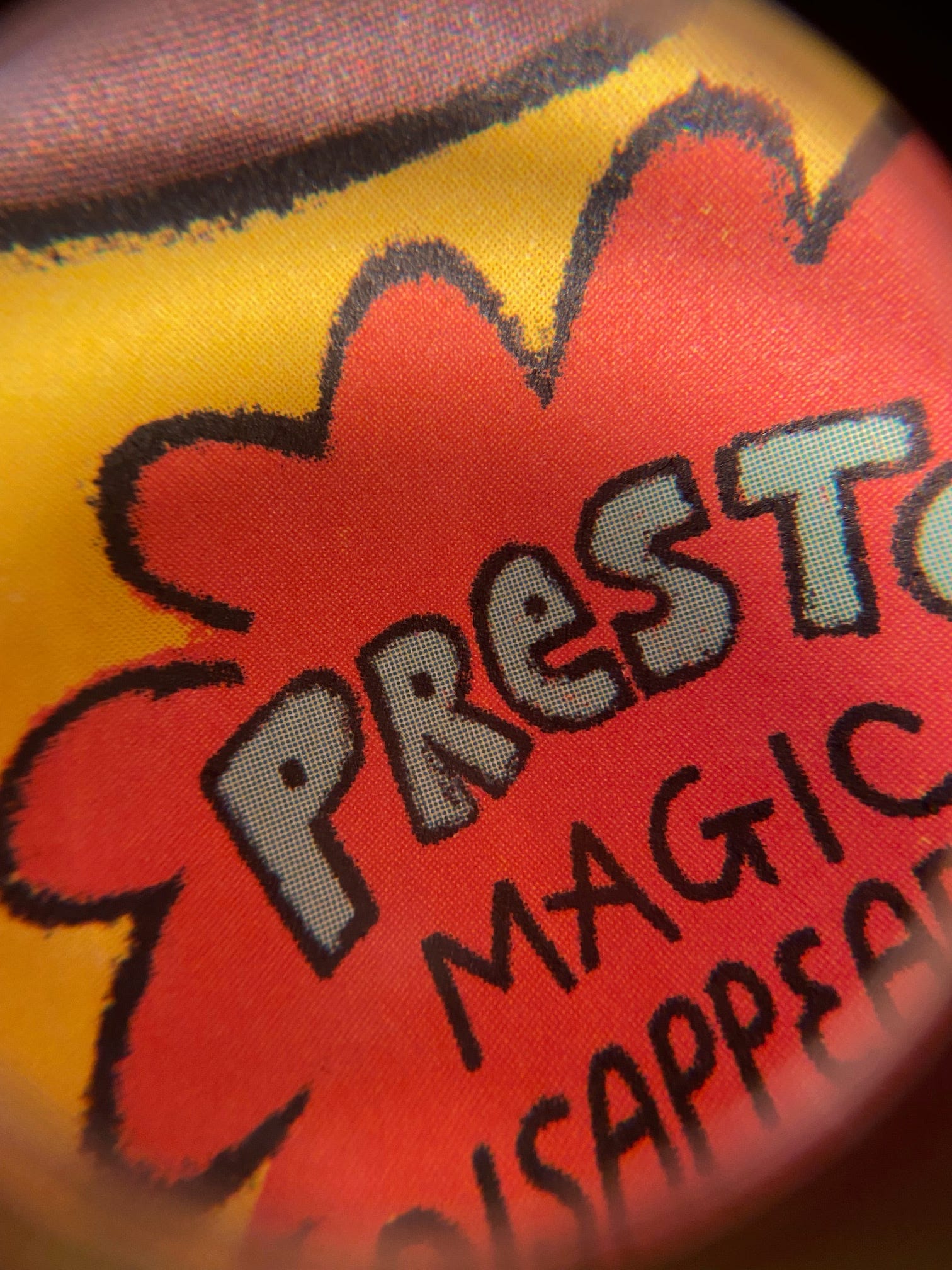
Now let’s take a closer look with a printer’s magnifying glass called a “loop”:
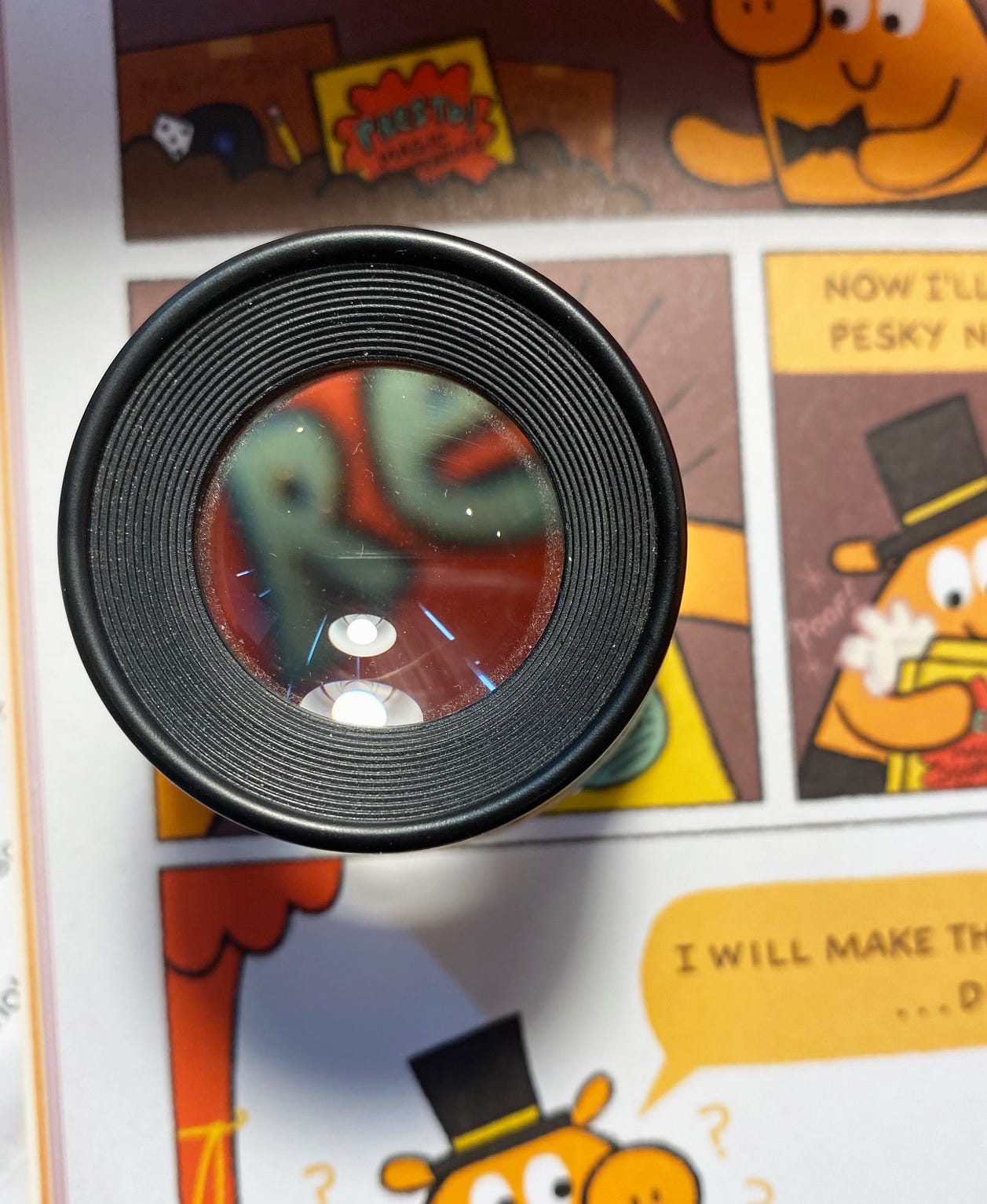
And now the view in the loop. If you look closely, you can see that the individual colors are created by a mixing of CMYK dots. Your eye is tricked into interpreting them as flat color.
SPOT COLORS on the other hand, are just the color. No trick of the eye, it’s the color you chose, right there. You might be able to halftone (or “screen”) the color to appear less dense so it prints at a lower opacity, but it’s still just that one color.
A good example would be my upcoming, destined to be a classic, better than nearly everything else out there, available for pre-order book, LUCKY DUCK. This book was printed in 4 colors - but NOT CMYK. It was printed in MINT GREEN, YELLOW, PINK (same pink as from The Watermelon Seed I believe), and DARK BLUE.
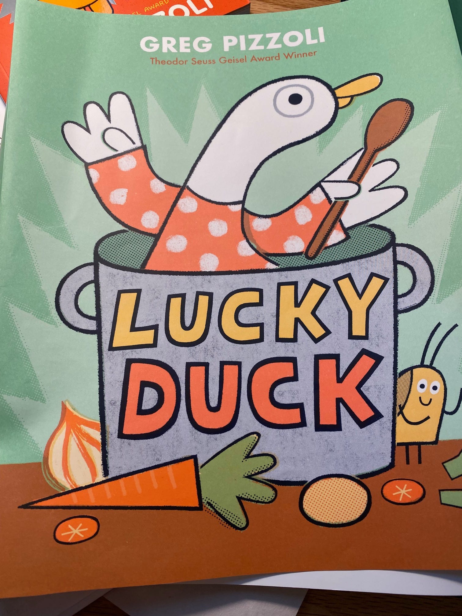
Before I draw a book this way, I ask my very obliging publisher to please get a test print sheet printed. For LUCKY DUCK (available for pre-order) it looked like this:
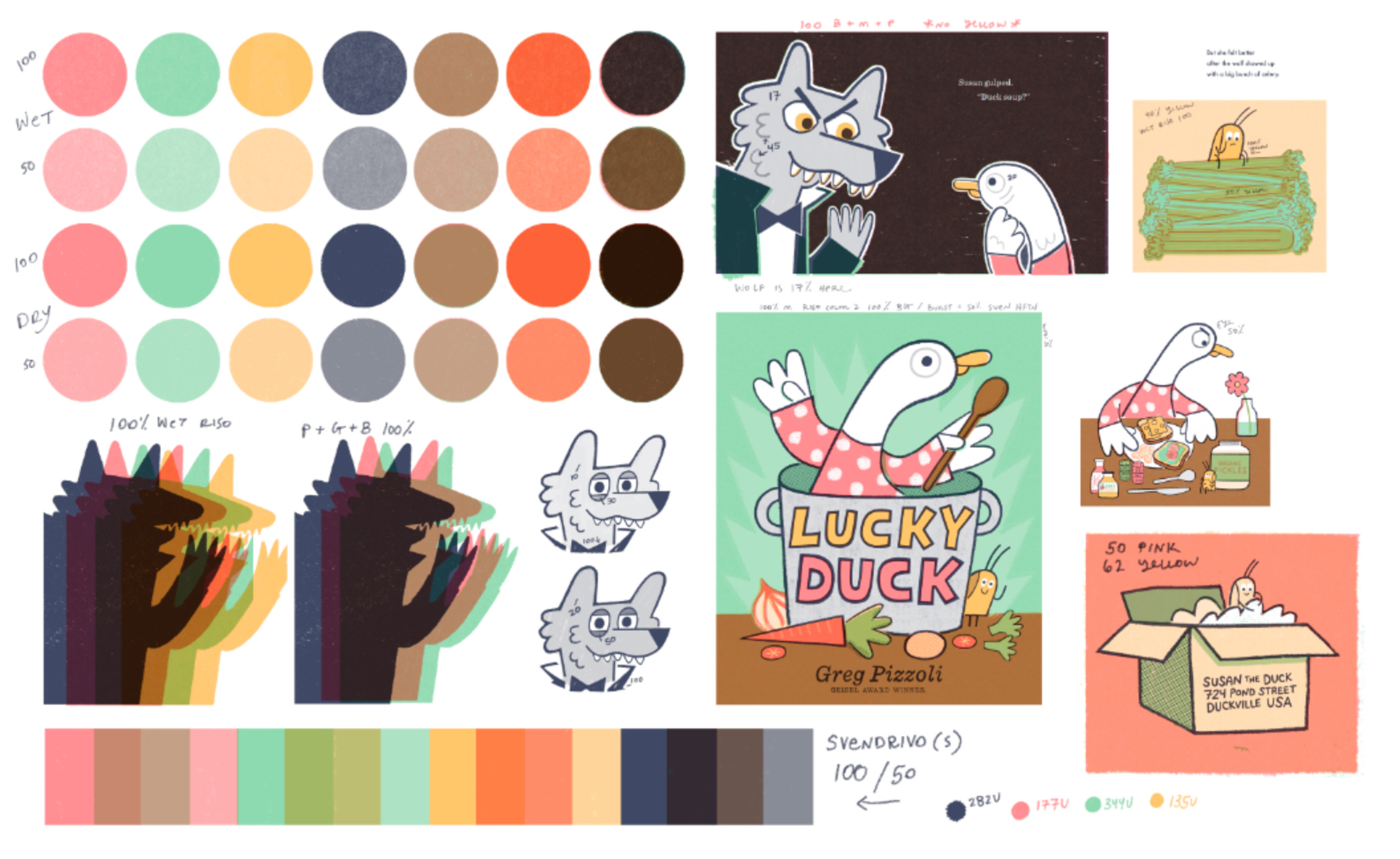
This gives me an idea of what the inks will look like on the actual paper, and how they overlap with eachother at different values.
Using these four inks, I can still make new hues by overlapping those unique colors on top of one another, but it’s ink laying on ink, no dots tricking your eye. Make sense? No? Let’s move on.
Because I have a background (and MFA) in printmaking, I typically design everything the way a printmaker would, which is to say with fewer colors. When you are printing things by hand rather than through an electronic printer, each new color you add to the press adds more time and labor and material. So lots of printmakers learn to design using limited colors for practical reasons. BUT THAT’S NOT THE ONLY REASON.
I can only speak for myself, but I think that once I began to draw and make things using a limited color palette, my brain changed, and I started to always think that way. I like the challenge of working with just two or three or four colors. I like the problem solving that comes with it. And it often yields unexpected and visually exciting results.
So I print spot, typically, when I can. It’s more expensive sometimes, and not every project warrants it - but when it makes sense and I have the opportunity, I print SPOT.
I think Rilla was actually asking for more of a technical breakdown - she knows all of the above - and is probably more interested in like, “Yeah, but how do you do it in Photoshop?” . . .
Is that something you would be interested in? If no, I can just email Rilla. If yes, I need to write out a few more posts.
In any case, thanks for reading. I appreciate you. If you want to pre-order my LUCKY DUCK book, it would mean a lot to me.
Thanks!
Greg
Thanks for being a subscriber and taking a look every week (or so).
If you have a question about how I made something (or really whatever) you’d like answered, please email me at jgpizzoli@gmail.com or send snail mail to:
Greg Pizzoli’s Fan Mail Corner
700 S 7th Street
Fishbox #5445
Philadelphia PA 19147
USA
This is Greg Pizzoli's Fan Mail Corner.
Have a great weekend, and thanks for being here!
👏😄 Yes please to spot color part 2 if you have time!
This is so cool! I’ve always been drawn to limited color palettes (especially that problem-solving side you mentioned) but I’m only now dipping my toes into the printing possibilities. Thank you for this breakdown; I would love to read the technical stuff too.